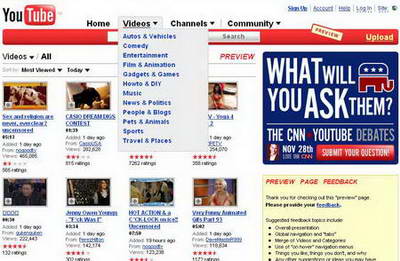
 Your online video watch on Youtube is getting a makeover. Website is going under the design hammer to bring in fresh and un-cluttered look. Besides the look, there seems to bigger plans for future changes or improvements on the website.
Official Youtube blog writes… “In a constant effort to improve the user experience and incorporate your feedback we’ll be making a number of large changes to the site over the next few months.
In addition to making improvements upon existing features, we’ll be rolling out some brand new items that are still in the works”. Here is sneak peek of the redesigned youtube.

So, what is new and crispy about the new look? Here goes some analysis:
- Top header goes from grey-silver to blood red. Man this look amateurish, really I think they can surely change color there, what say?
- Categories will now be found under the “Videos” tab. Just move the cursor over ‘videos’ and much ugly menu will appear. My explorer font settings are good (set to medium), even then the top menu fonts are way too big… I simply don’t like it!
Comparing the proposed look and current look, so called look based on user feedback (blah blah) it looks way too amateurish with videos stack on one by one. Current look is so lively and make you tempt to click and watch few videos. New look is complete turn OFF.
Youtube: Current look – Proposed look - your views at youtube
Also, youtube seems to be in hurry to implement these, as official bog states… “These new changes will go live very soon, so make your voice heard while we’re still workin’ out the kinks”.
New look of youtube, you like or hate it? I surely hate it, youtube can surely afford some quality designers, what say?
