Flat design is now rage for online products. Microsoft implemented successfully with Windows 8 operating system which was also called as Metro user interface. Now Google has given makeover to logo with all new flat design. Besides the logo, Google website now looks much cleaner without the dark space hogging top navigation bar.
New Google logo with flat design
While logo keep its original font and colors – it has lost curves and now is simply flat. New flat design Google logo does look refreshing without losing its real identity.
![]()
Above is comparison of old Google logo and new Google logo. Clearly, new logo looks much cleaner and refreshing, what say?
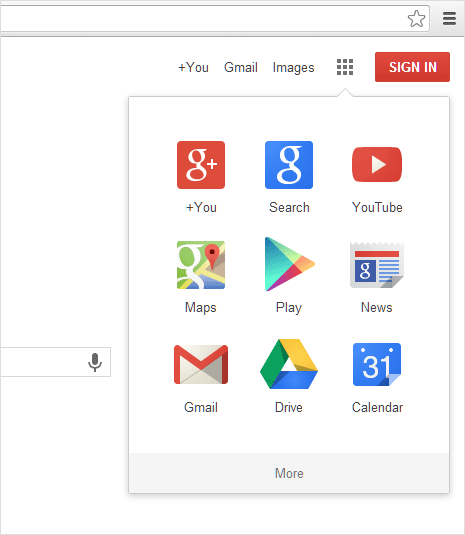
Grid button replace the black top navigation bar
Black top navigation bar has been removed and replaced with much neater implementation. New interface has only three links for: Google+, Gmail and Images. It also has grid button which can be used to quickly access all Chrome apps in one view. Sign in button is also present at top right part of Google website.
Overall, Google logo and website interface makeover is a welcome change. Now website has much neater logo and top navigation structure. If you still see old Google logo and interface design – just wait for few weeks, it should be live for everyone soon.