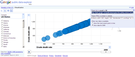
Making sense of large amount of public data related to any human aspect like mortality rate, wages, population is very difficult. Huge volume of data makes interpretation and representation very difficult. Easing out this process is new experimental online tool from Google ‘Public Data Explorer’.
How to use Google public data explorer
It allows you to explore large datasets and further visualize, communicate with them. As charts and maps animate over time, the changes in the world become easier to understand. You don’t have to be a data expert to navigate between different views, make your own comparisons with data representation in the form of line chart, bar chart, map or bubble chart.

Just head over to Google public dataset directory [demo here] and click through to explore type of dataset of your interest. On the exploration screen, select the specific date for refined data exploration. You can also toggle between different chart views among chart, bar chart, map or bubble.
It also allows you to share any dataset visual exploration: just click “Link” button and grab codes to share on IM / email or code to embed it on website or blog. For sure one easy online tool to make sense of huge dimension of public data, try it!
